Aldar | Brand Development
Brand strategy | Typography | Colour exploration | Visual identity
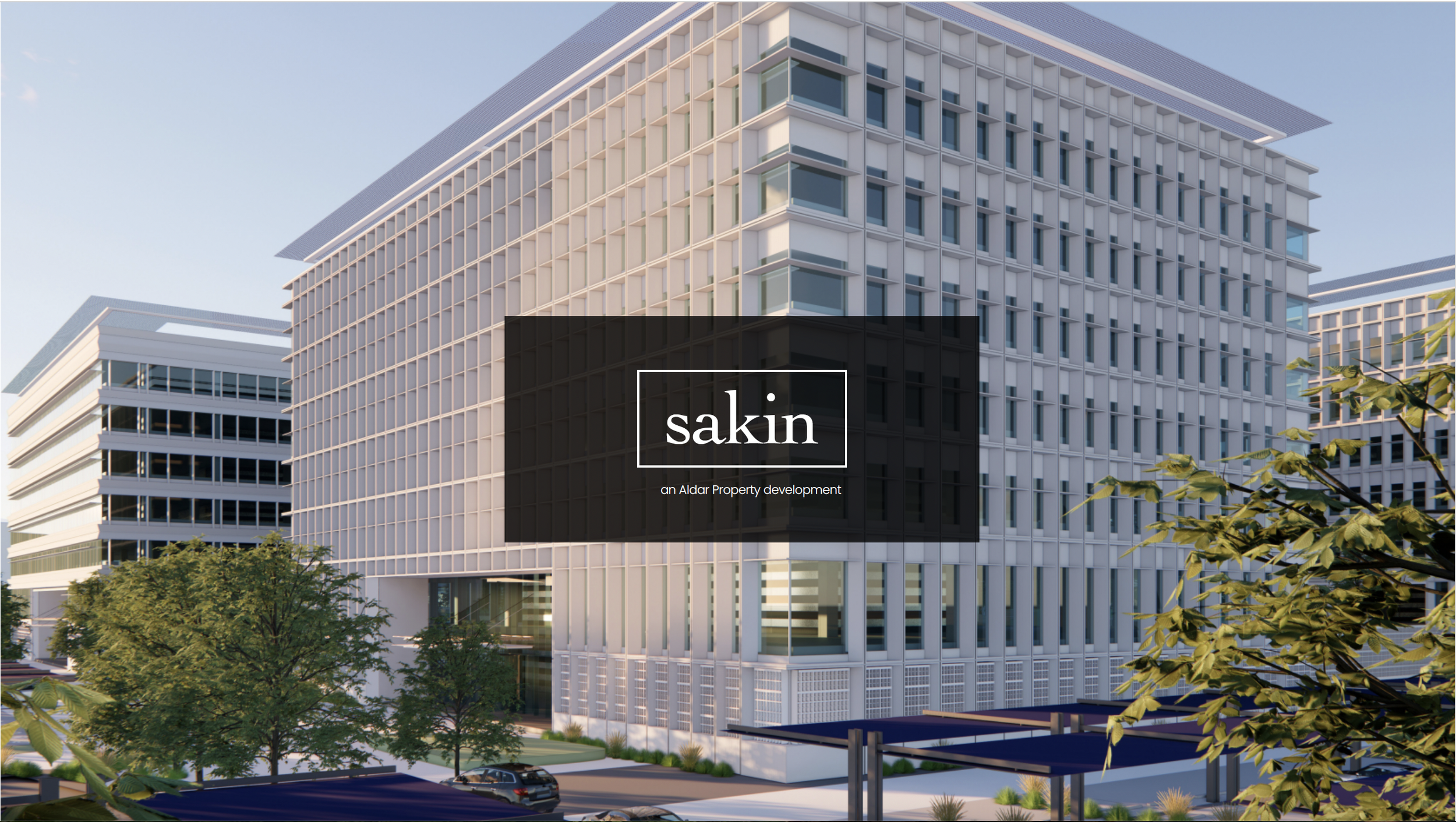
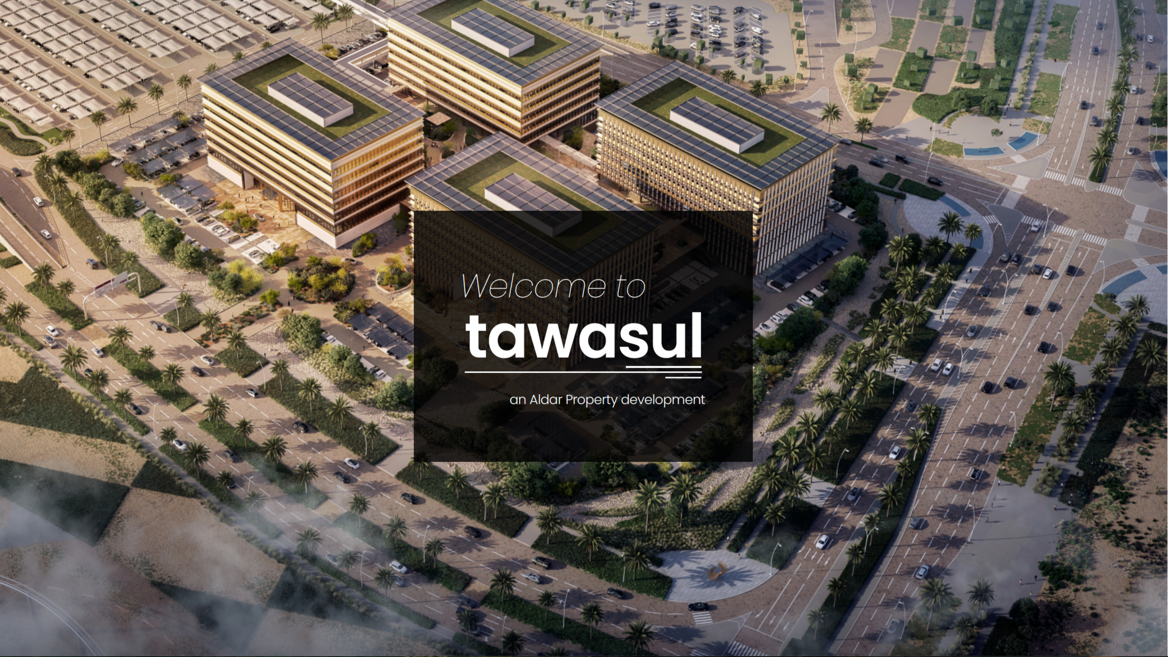
A brand exploration developed for Aldar around a proposed business park on Yas Island.
The proposal explored multiple creative directions to establish a brand which would feel modern, confident and stylish to match the client’s focus on sustainability, quality, technology and innovation.
The Brief:
The objective was to explore the foundations of a brand for the launch of a new business park. The identity needed to appeal to modern businesses, professionals and visitors.
Rather than immediately moving towards a single logo/word mark solution, my proposal explored the broader aspects of the identity, from naming and typography through to colour development and use examples.
Naming Exploration:
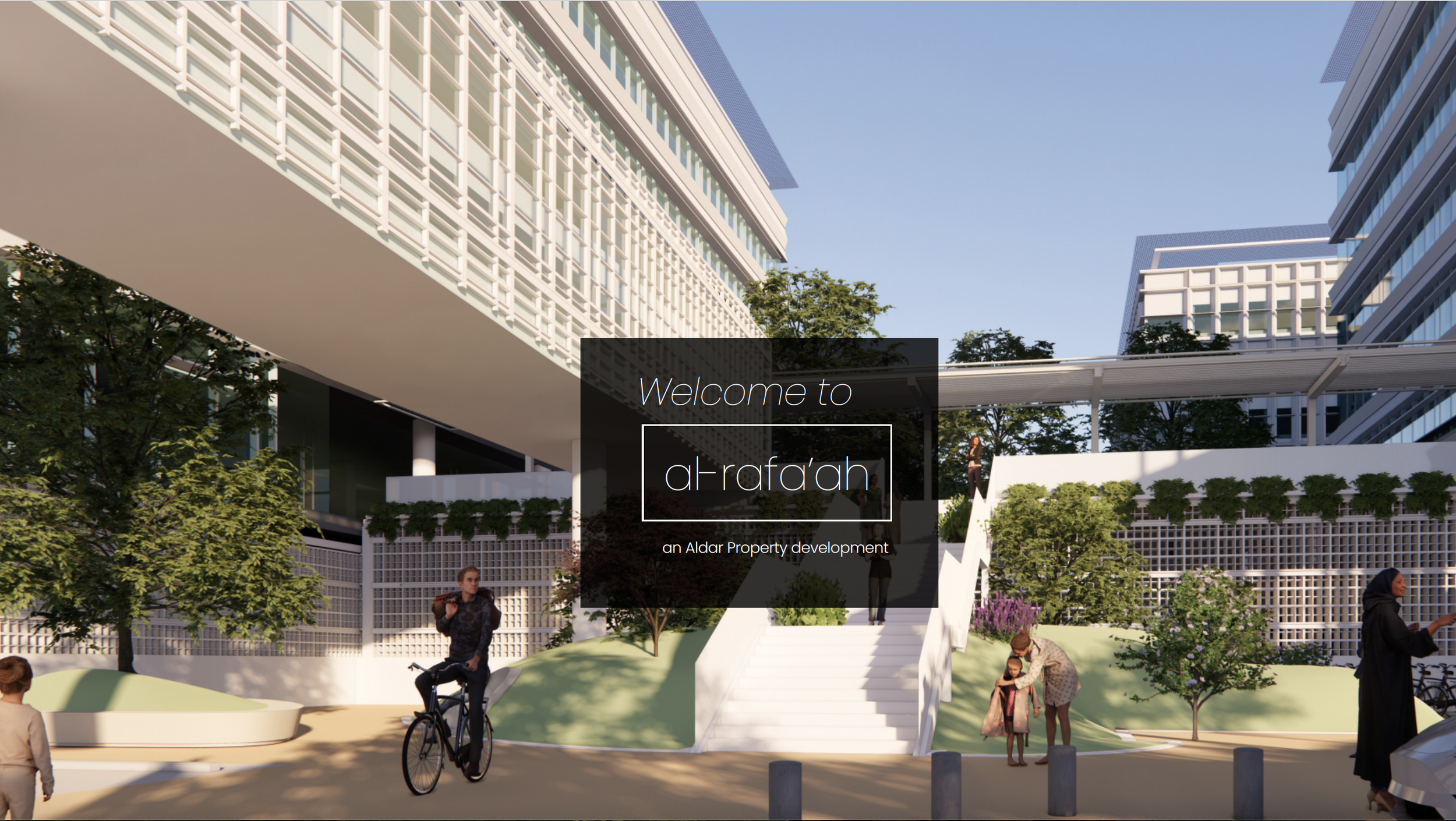
The client had indicated that English, Arabic and Arabizi (Arabic words using English letters) would be well received.
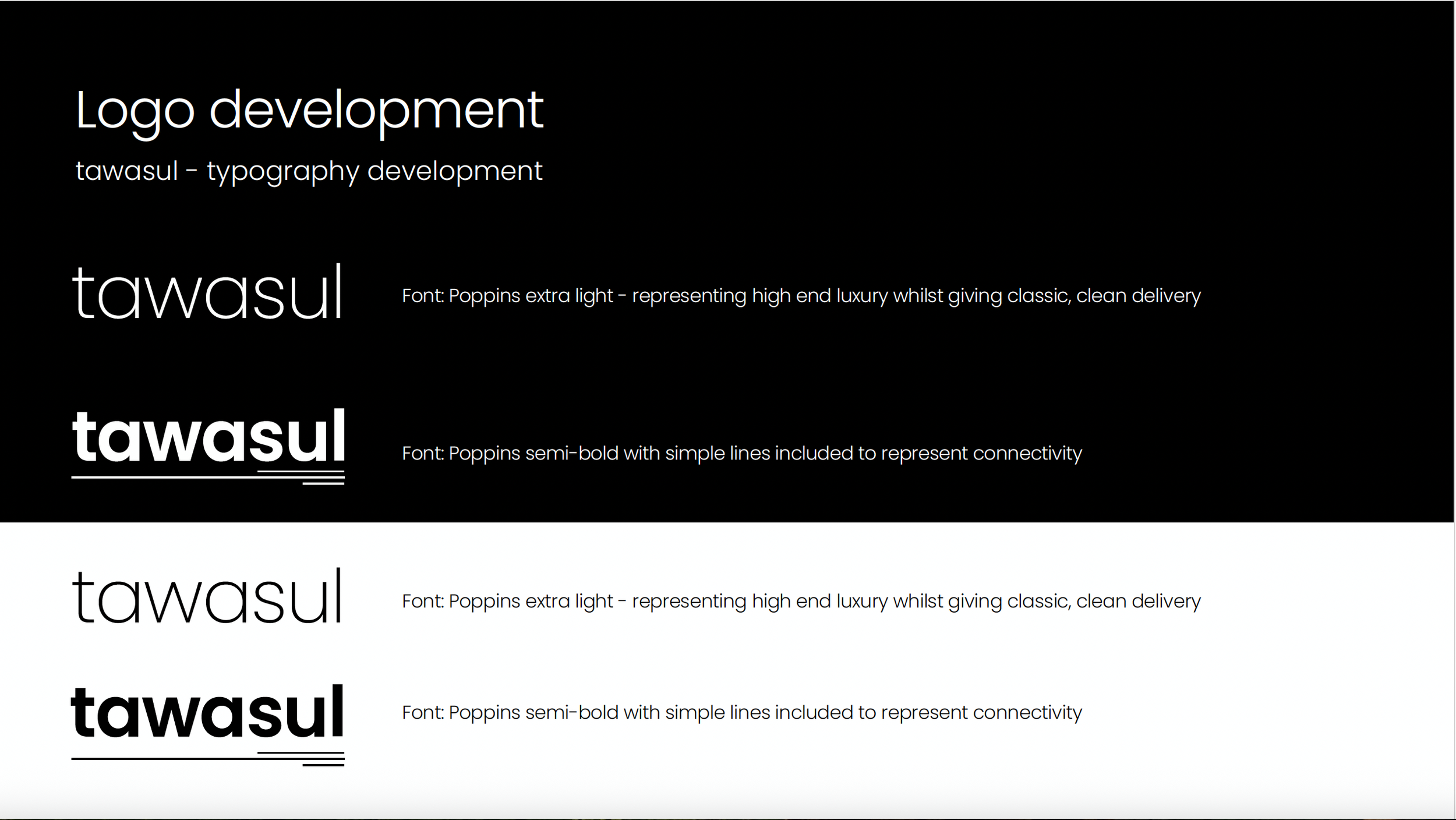
The strongest candidates were then developed as typographic identities, allowing the name itself to become the foundation of the visual brand.
Typographic Identity:
With the names established, I explored how typography could give each direction its own personality.
A range of typefaces, weights, proportions and letterforms were tested to understand how subtle typographic decisions could shift the perception of the brand — from more established and corporate to contemporary, progressive and distinctive.
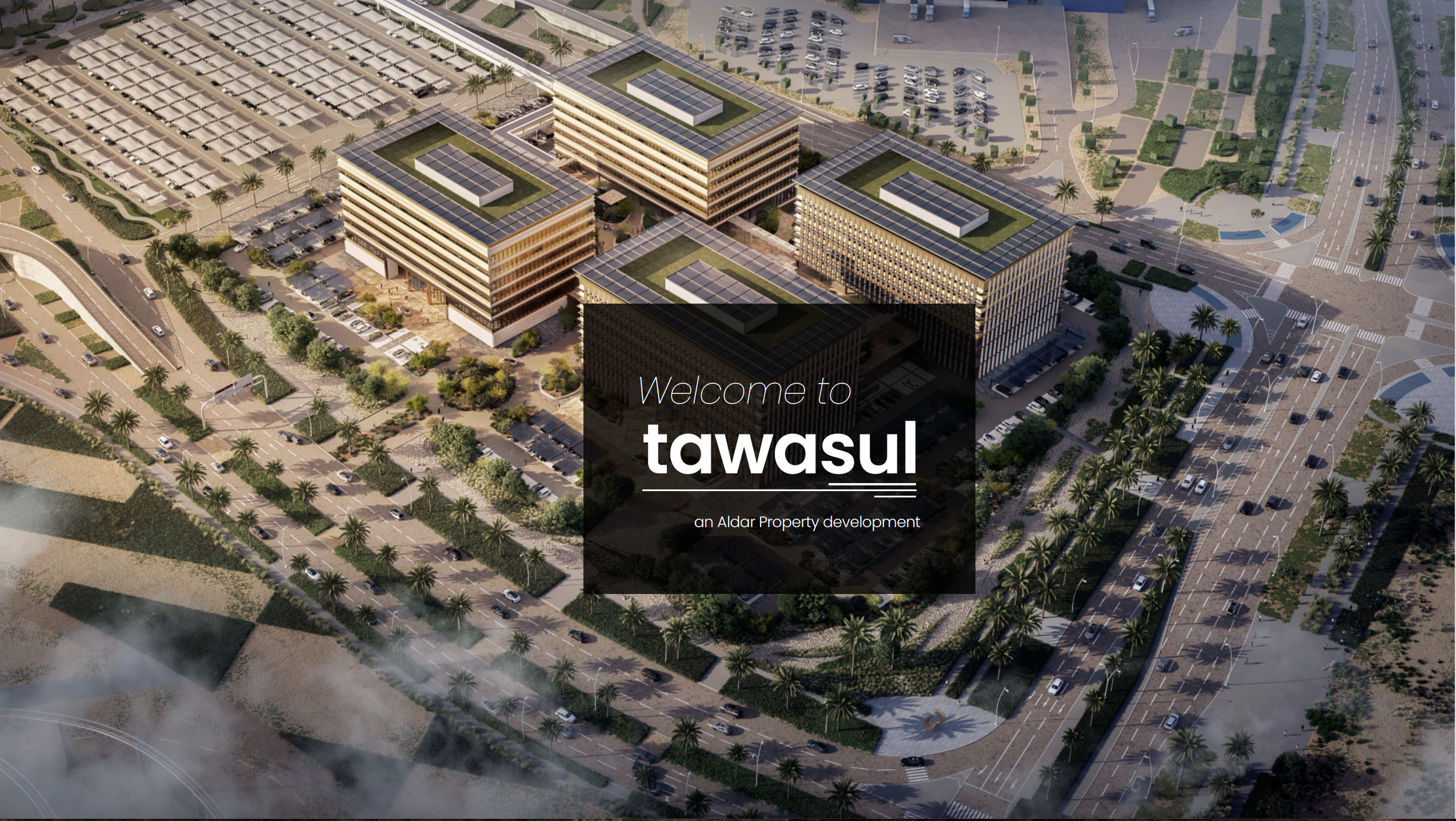
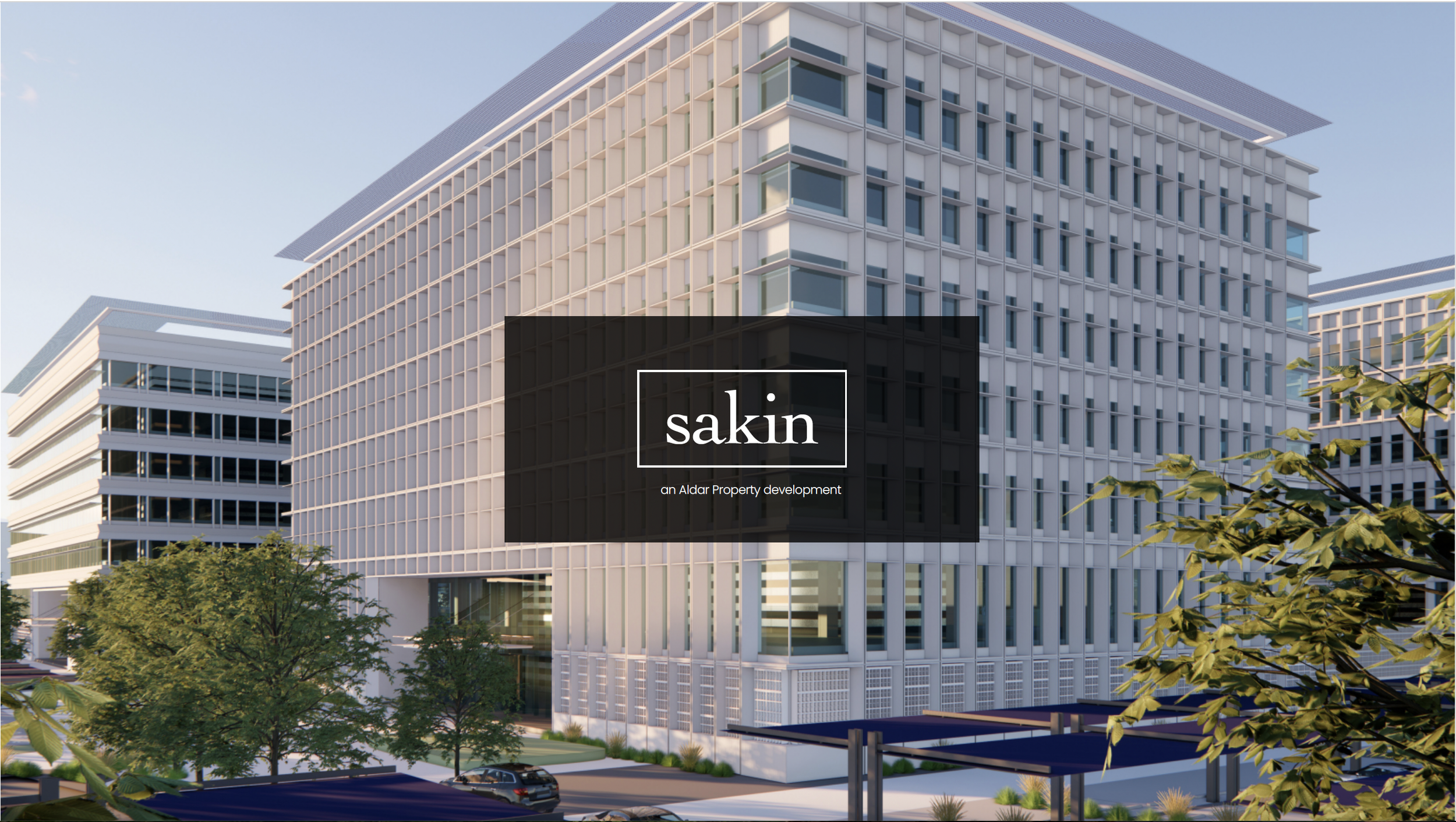
Rather than relying on a separate symbol, the proposal explored name-led identities, allowing typography to carry much of the brand recognition.
Colour & Colour Theory:
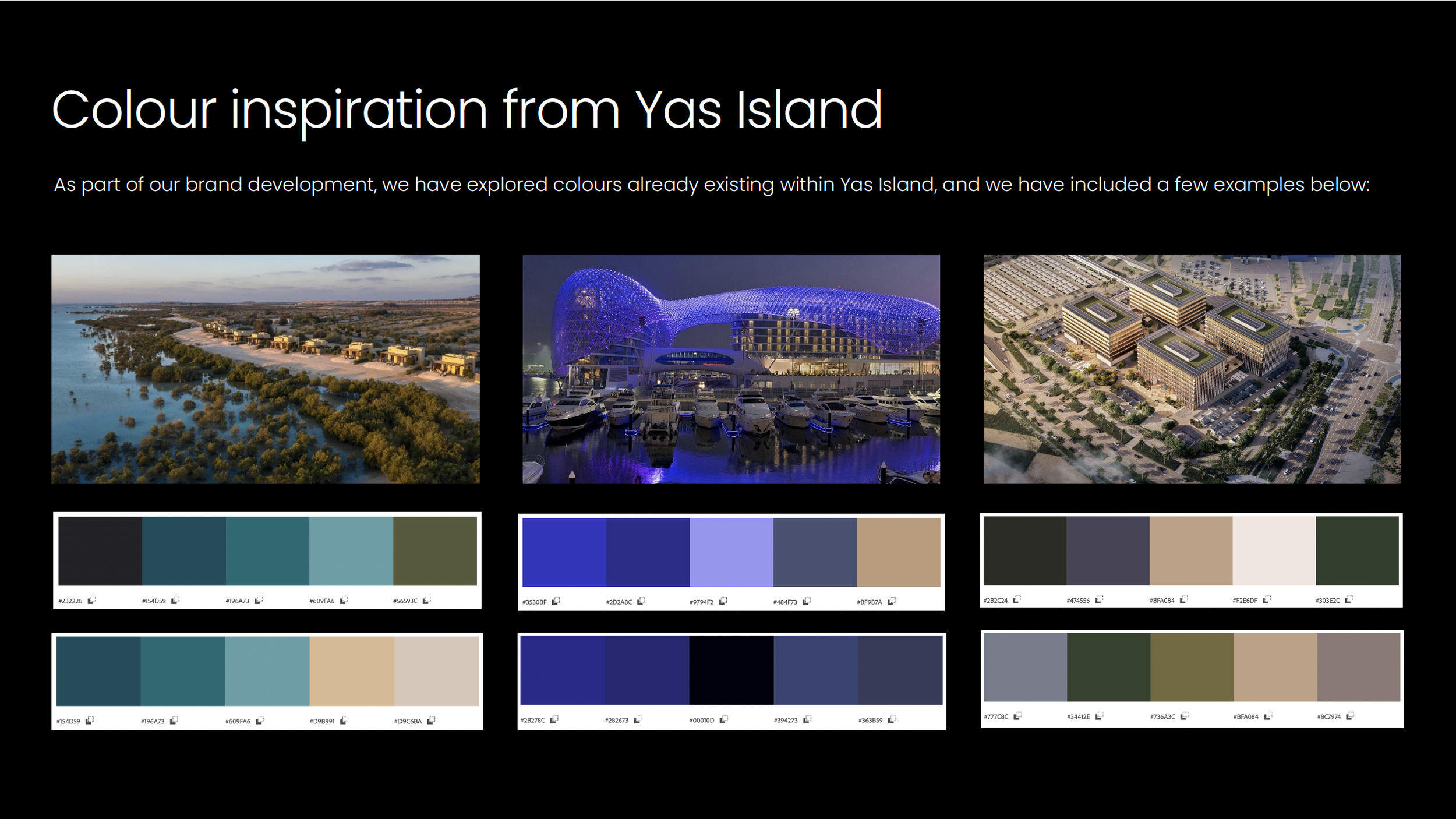
Colour exploration formed another key element of the proposal.
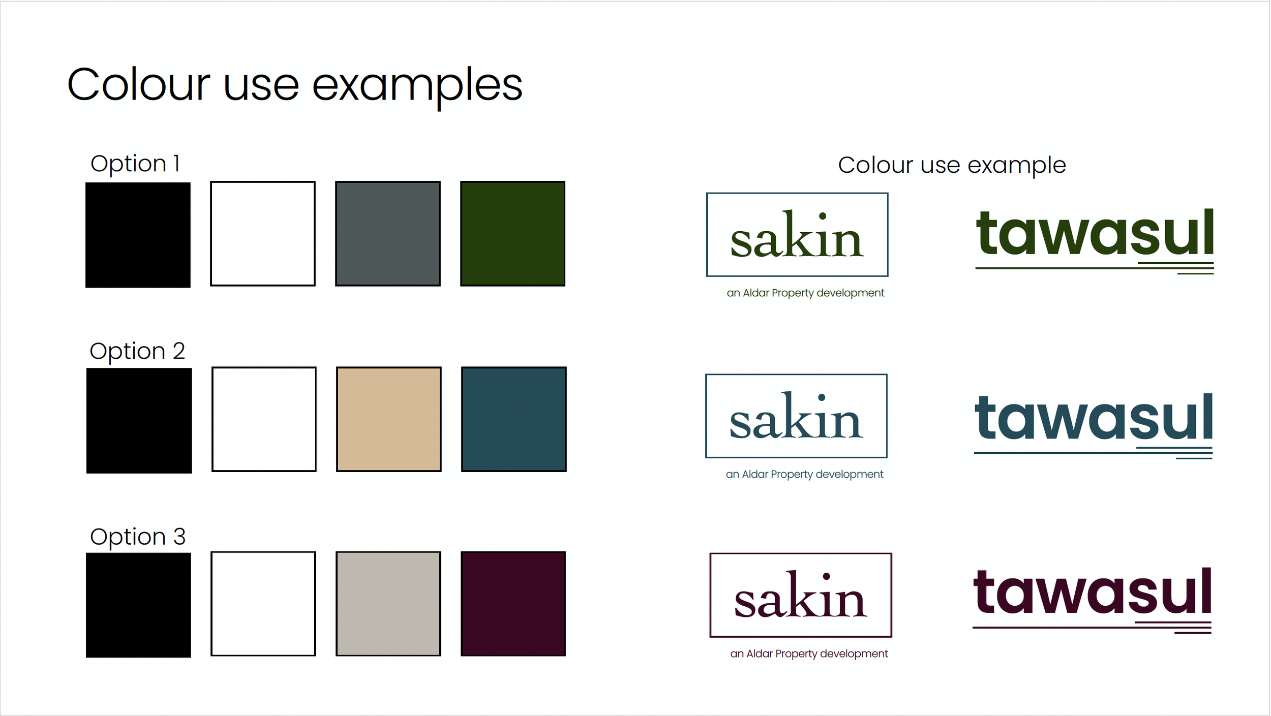
Different colour palettes were explored using inspiration from Yas Island and nature, and I used colour theory and colour meanings to ensure the pallet would build a sense of community and wellbeing, and the way it would impact how attendees would feel.
Bringing the brand together:
The strongest directions were brought together into broader identity explorations, showing how the combination of name, typography and colour could establish a coherent brand identity.
The proposal was designed to demonstrate not just what the logo could look like, but how a scalable visual language could be brought to life.